Dec. 7, 2020
Own font vs. license — what is better? Interview with Ivan Rogovchenko

6 min read
Own font helps to unify company communications and cut license fees.
Most of the WePlay! Esports’ business activities are centered around hosting and coverage of competitive gaming tournaments, as well as the development of the online tournament platform. In this line of work, it's crucial for a company to pay careful attention to visual design. One of the projects our creative team has been working on is the development of a unique font called WePlayType.
It is developed by Kyrylo Tkachov, one of the best font designers in Ukraine. He also created fonts for the Comfy and Torchin brands and also the Dnipro and Lutsk cities. Kyrylo’s portfolio includes fonts and logos for the Ministry of Culture of Ukraine, Ministry of Education and Science of Ukraine, and Ukrainian tourist brand. He also developed the logos for Ukrainian Railways, Book Forum, and Zaxidfest.
WePlay! Esports Chief Design Officer Ivan Rogovchenko has shared why a company that works in esports and entertainment needed to create its own font.
There are dozens of online boards where you can find various fonts. Why did WePlay! Esports need to invest in font development?
— In the early months of 2018, when we were designing the current brand, our team started to evaluate the future points of contact between the users and the company. Back then, we were building our broadcast studio, working on the WePlay.tv platform, planning to recruit an editorial team. We also had an active marketing department.
It was challenging to make every part of the project look the same way. We needed to make sure that the logo and the two colors are not the only things in common between all the company products. A user must experience similar emotions while interacting with the brand, no matter how it happens: during an online broadcast, in social media, at a tournament venue, etc.
The reason why we needed the font was helping to ensure consistency at all points of interaction with the company.
The agency that was helping us to update the WePlay! brand book suggested a particular mix of fonts. At that point, we faced another challenge — the need to choose the most appropriate license. It was very tricky because we had to account for a high amount of details and predict the avenues of company growth in the future. Since WePlay! Esports has been growing rapidly, we couldn’t foresee how we would need to use those fonts in the future, which made working with a license complicated from the financial planning point of view.
The idea to create our font first came out during a conversation with one of the company founders.
These are the advantages of using own font for a company:
- The problems with licensing are eliminated.
- It increases the grade of the brand originality.
- The font can adapt to new tasks and changes in the business environment.
- The design team is more eager to work with the font they helped to create.

Ksenia Babankova, WePlay! Esports Art Director
— In a company identity, the font is not just letters that form a text. The perception of the font, logo, and the whole corporate identity must be holistic.
There are free fonts, and there are those that you need to pay for. As a rule, free fonts have a limited amount of styles and glyphs. They are quite suitable for small companies.
The paid fonts are much more expressive and varied. They support a higher amount of languages. A commercial font can solve a broader range of tasks that a brand may have. The tradeoff is a high price that the company needs to pay. That is why big companies decide to create their fonts, though it’s not cheap and takes a lot of time. On the other hand, it pays off in the long run.
Own font can be updated and improved when a need arises. The WePlay! font is already used in various materials and thus being actively tested to find areas where it needs to be tweaked and enhanced.
How hard is it to develop a font?
— I have been working in design since 2002-2003. At first, developing a font seemed like a very long and impossible task for me. But when we started to scan the market, it turned out that the price is comparable to licensing, and the whole project could be exciting.
We began looking for contractors. With the help of people I know in the creative field, I compiled a list of font designers and got in touch with all of them.
In the end, we chose Kyrylo Tkachov, who happens to be one of the best font designers in Ukraine. The most prominent item in his impressive portfolio is Ukraine Now. Kyrylo created the font for the graphics and logo that was developed by Banda Agency.
We quickly came to an agreement and began working together.

WePlayType designer Kyrylo Tkachov. Photo by Oleg Burlaka
— While the font required a lot of creativity, I’d say there was even more technical work. The later absorbed most of the time and energy.
This job has taken a longer time than most of my other projects (more than one year already). The font has unusually many styles — I’m working on the sixths and getting ready for the sevenths. There are also additional testing phases.
At first, we were working on just a title font, now WePlayType has expanded and must to satisfy every possible need.
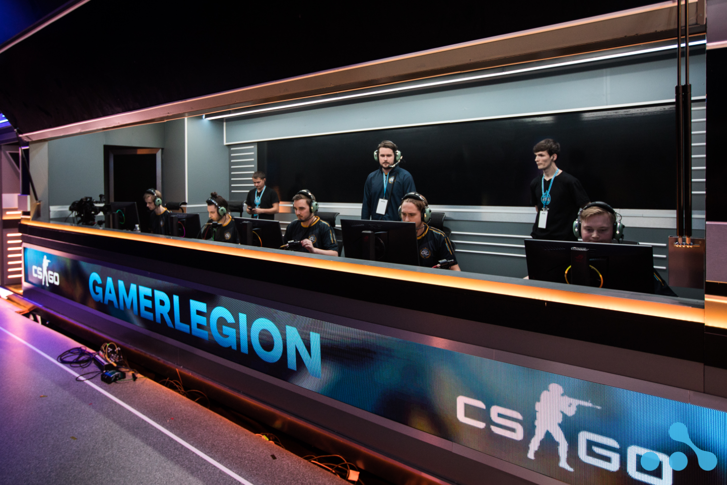
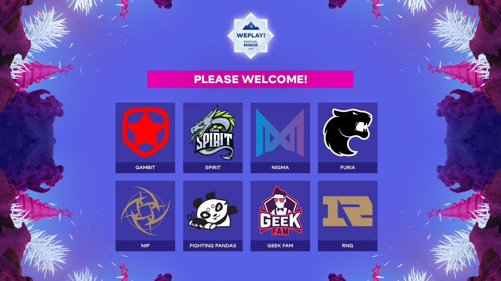
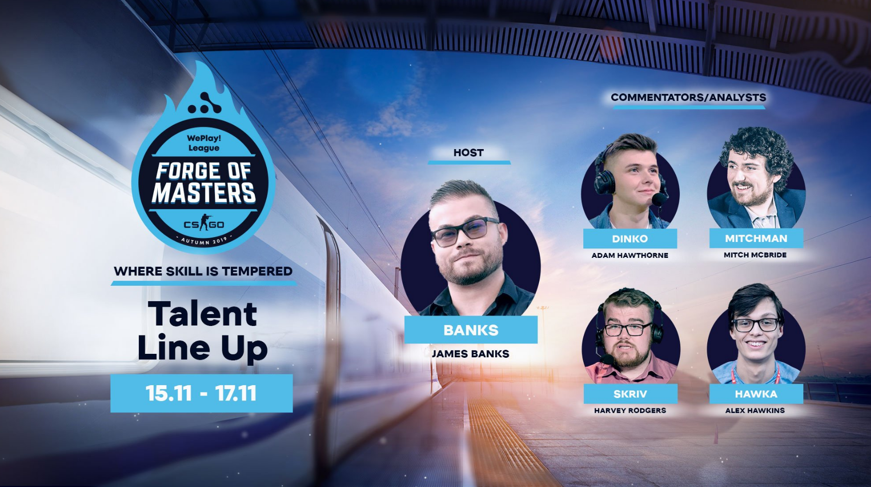
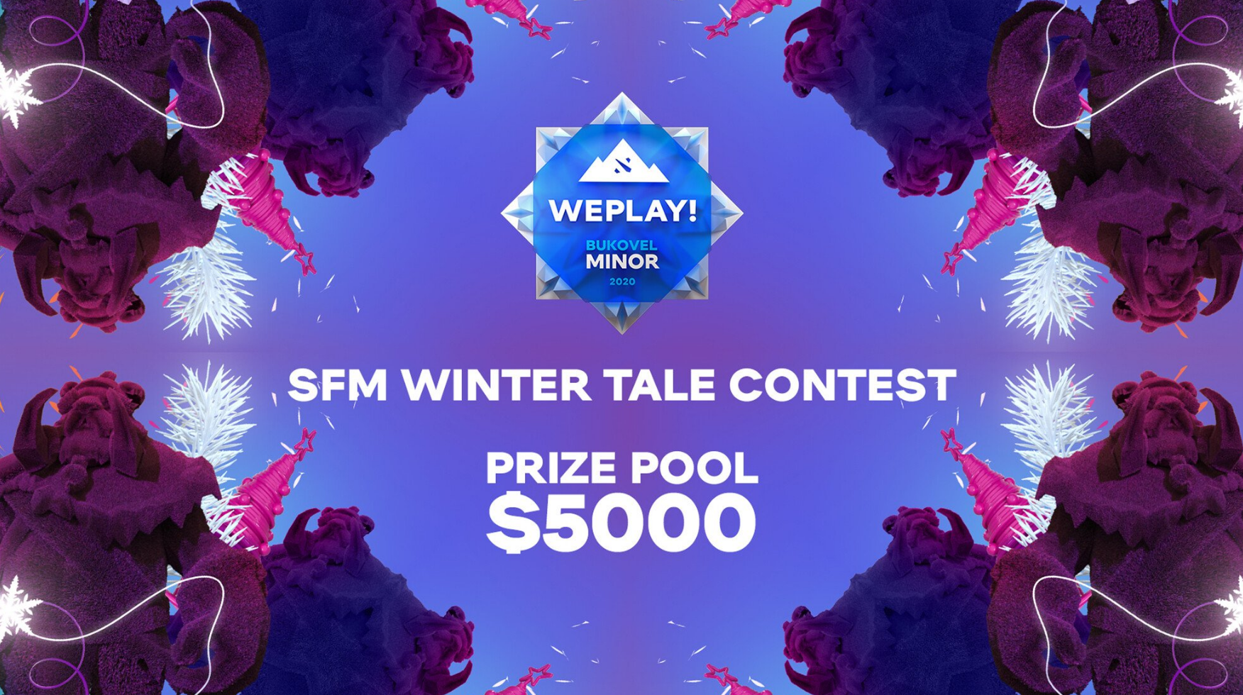
Here and below on this page are presented the use cases of WePlayType.
What is the current status of the new font?
— WePlayType is actively tested. It’s one of the advantages of having your own font — you can improve it, tweak the letter and line spacing, etc. We can impact how the font is shown in a web browser or a word processor.
Some changes happen here and there. We intend to finalize and start using the font on all our websites in the first quarter of 2020.
How much time did it take from the moment when the decision to create the font was made until the active testing phase?
It took 8-9 months. I’m sure, we could speed up the process. But that’s the pace we are comfortable with.
Now that you’ve come this far, would you recommend other companies to develop a font, if they had similar needs?
— If a company doesn’t want to use free fonts and needs to distinguish the brand, I would highly recommend considering developing its own font. The expenses are similar in both cases, but own font gives more benefits.
Where will WePlayType be used when it’s ready
— As I’ve said before, WePlay! Esports is rapidly growing, which is why we can’t predict everything. For now, we are planning the following use cases for WePlayType:
- In marketing materials (text and graphics)
- In esports broadcast production
- In social media
- On WePlay! Media
- In B2B-communications
- On the tournament platform
- In the internal communications
How many styles does WePlayType have?
— At this time, we have four styles of WePlayType — Light, Regular, Bold и Extra Bold.
Three more styles are being developed. We are adapting the font for our website and visuals for the production team.
It’s hard to come up with a universal solution considering the broad range of our products. That's why we decided to create various WePlayType styles. Some of them will be used for very narrowly defined tasks.
Do esports companies usually develop their own fonts?
— Not many companies have their own fonts. The only example I can give at a moment’s notice is the Twitch streaming platform that introduced its font after the rebranding.
Does WePlayType impact the work of the company design team?
— I’d say that it gave a boost to team morale. Overall, very few designers have such a unique instrument at their disposal.
All image credits on this page belong to WePlay! Esports, unless indicated otherwise.